HOW CAN WE LEVERAGE LUDIC EXPLORATIONS AND SELF-DRIVEN NARRATIVE TO MAKE MENTAL HEALTH APPROACHABLE AND ACCESSIBLE?
THE PROCESS
VALUE PROPOSITION
Convenience & Accessibility : As the experience was predominantly facilitated using a mobile device, it allowed the product to be scalable and accessible to a vast market. It also nicely situates itself in the growing space of self-care.
Emerging Tech: Augmented Reality: Having a strong interactive augmented reality component embedded into the core experience allows the users to be placed into a more active role. This will help to engage users on a more playful and kinetic manner, which in-turns improves user retention.
Simplicity: The experience stripped down is quite a simple exercise. This takes away the users initial informational overload experienced in other applications.
SiteMap + Low-Fidelity Wireframing
Creating an initial sitemap helped to construct the planned information architecture for the application. I evaluated the primary user objectives and goals, as well as how the most significant content and interactions could be rationally grouped. This also helped to define accessible entry points into the core experience of the app aswell as the bottom navigation.
Lo-fidelity prototyping provided an opportunity for me to visualise the structure and information hierarchy of the user interface. It allowed me to begin exploring the intended user journey and how a realistic user would go about approaching the application. A key insight was the positive inclusion of the FAB (Floating Action Button) which afforded a quick entry point into the drawing flow from all screens.
Brand positioning & Visual Strategy
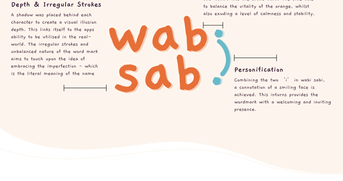
I wanted the brand to be situated within the Artist & Explorer archetype and convey attributes of Connection, Reflection, Comfort, Wellbeing and Playfulness.
The logo design was to be reflective of the playful and welcoming nature of the app, whilst also playing into the name sake of the app wabi-sabi. In essence wabi-sabi means to; ‘appreciating beauty that is imperfect, impermanent, and incomplete in nature’.
To ensure consistency of the app UI, a style guide was created to specify the context i n which colour and text size should be used. With the CTA, the option of Orange or Blue was available, but I ultimately chose blue as it was a-lot more readable whilst still being distinctive if used on a screen. Text size and the context in which it’s used helped to create clear informational hierarchy, in turn helping users navigate and digest content easier.
illustrations
Approaching illustrations was a daunting experience as it was a field I’ve never really been in contact with. Bringing over the crafty and unrefined charm of the brand visual direction and logo, I created illustration built upon abstract blobs. The rounded blobs create a soft and inviting atmosphere and the addition of eyes and mouth gave it personality and emotion. These simple yet charming character feels unified and cohesive in its structure and use of solid colours.
FIGMA PROTOTYPE + SPARK AR
After defining the sitemap and style guide, Figma provided an opportunity to visualise how these flows will be perceived by the user. I was able to build a strong brand identity across the apps UI through the use of colour, font and illustrative style. After the screens had been finalised it was time to prototype and mock up the ideal transitions between the screen. It gave life to the design and allowed for important user testing to occur.
As for the AR component, to build the core function, a Plane Tracker patch was used to allow a 3D object to be positioned at any depth within the scene. Once this was established parameters and commands were specified for the user input and desired outcomes. Instead of a button, I found it was most intuitive if users were able to use touch to activate the drawing functionality. Touch & Hold would be the primary method of interaction and would trigger particles to be spawned onto the scene. These functions were linked to a specific particle system that had varying textures applied to it. This gave variation to the output and allowed users to be more expressive in their drawing.
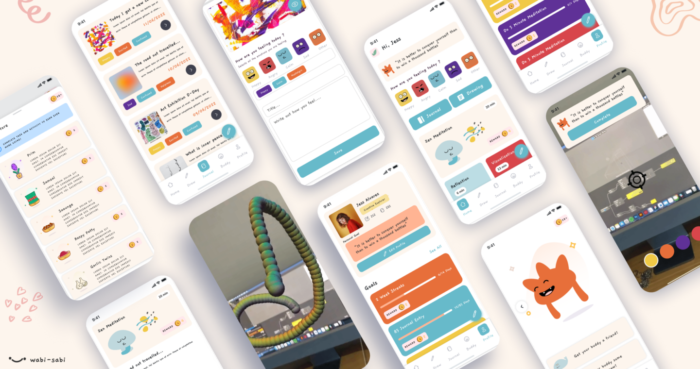
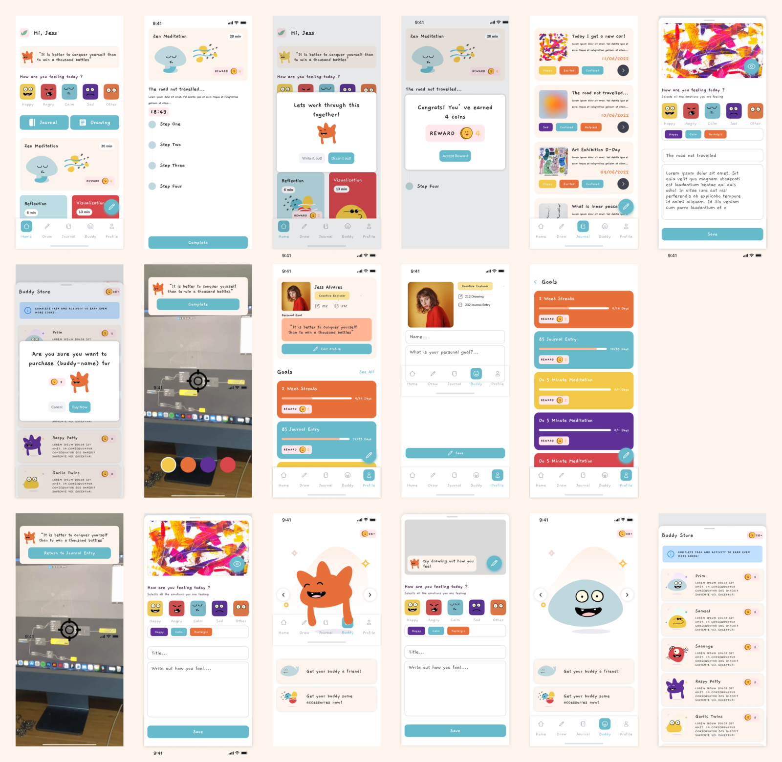
FINAL PROTOTYPE
App Demo
AR FEATURE DEMO
GIVE IT A GO!
Figma Prototype
Make sure to select ‘Options’ in the top right corner —> then select ‘Fit to Screen’
https://www.figma.com/proto/KmyMyf8ZcSjfb2XDdmsCle/WabiSabi%3A-Final?page-id=0%3A1&node-id=1%3A4809&viewport=1034%2C587%2C0.25&scaling=contain&starting-point-node-id=1%3A4809
AR Program – Via Instagram or facebook
Instagram: https://www.instagram.com/ar/3351021828474552/
Facebook: https://www.facebook.com/fbcameraeffects/tryit/3351021828474552/
Thank you for reading! 🙂